Tuttnauer
How we helped a global leader in healthcare create a fresh web presence, strengthen their brand, and stay atop of rising competition.
- Branding and Identity
- Copywriting
- Strategic Consulting
- Style Guide
- Team Coordination
- UI U.S. Site
- UX Technicians Service Site
- UX/UI Blog
- UX/UI Distributors Zone
- UX/UI International Site
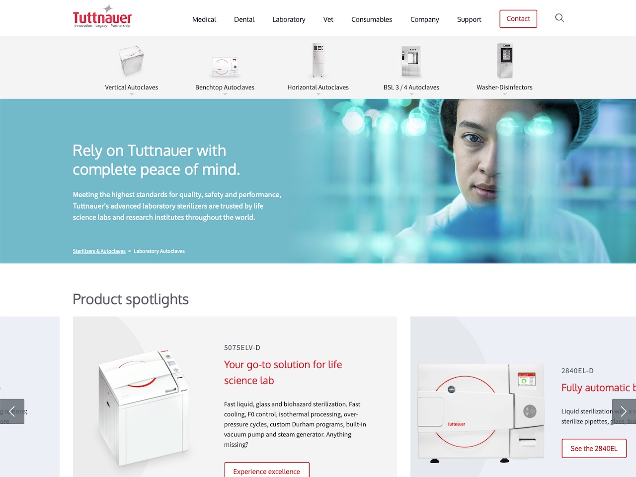
Healthcare Website Design
Tuttnauer has been manufacturing high-quality autoclave sterilisers for over 90 years. As a global leader in sterilisation and infection control solutions, their autoclaves are trusted by hospitals, research institutes, clinics, and laboratories in more than 140 countries.
We partnered with Tuttnauer to design their new international website, give them a consistent brand voice across platforms, and strengthen their brand online. The work included strategic planning and research, branding and identity, UX and UI design, copywriting, content writing, and the production of a style guide for future content marketing.
The Challenge
Tuttnauer is a powerful brand name offline, catering health institutions in 4 different markets all over the world. However, online is where the new customer acquisition happens, and where products are compared directly with those of competitors. Thus, the main objective was to build online trust with old and new customers from all market segments. This does not only require a sharp online presence with an effective information structure, but also aligning the corporate vision with the customers’ technical and psychological concerns. Staying atop of rising competition requires a real understanding of how clients compare and seek products, along with the considerations involved in decision making.
The Solution
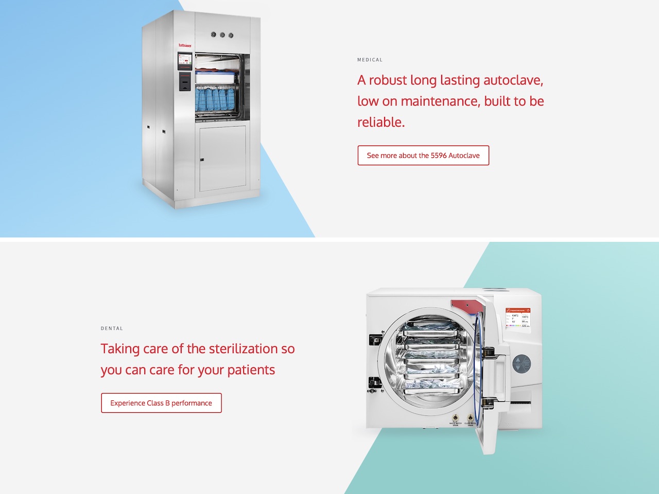
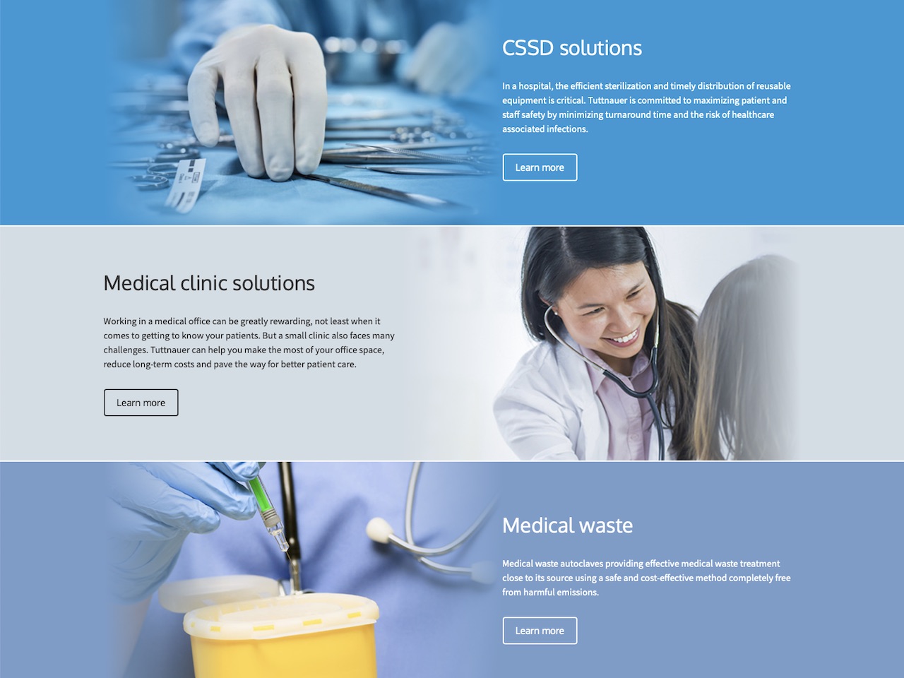
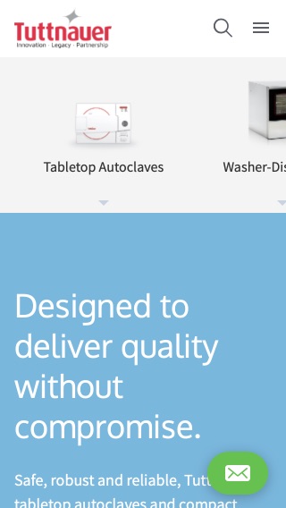
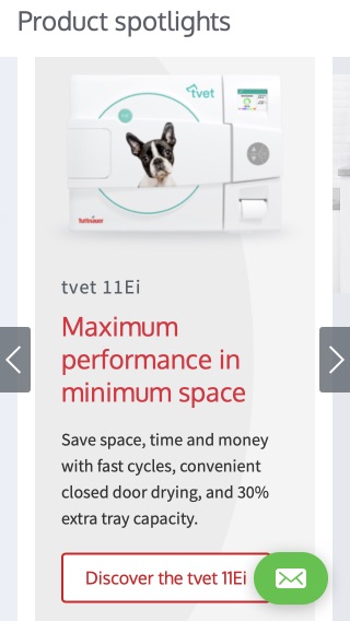
Researching how users take decisions, what data is most essential to them in a highly technical market, and what it takes for them to gain enough trust to initiate contact with sales or distribution determined everything from the UX strategy and UI design to the copywriting and stylistic guidelines for future content marketing. This resulted in a fresh, clearly branded design concept with defined market segments, each having its own gateway in the site. The products can be viewed and compared through the funnel most fitting for each persona, allowing for a catered marketing funnel with specialised content, and increased search engine visibility.
The Result
Over 250% increase in lead generation within a few months after launch.
Visit Site